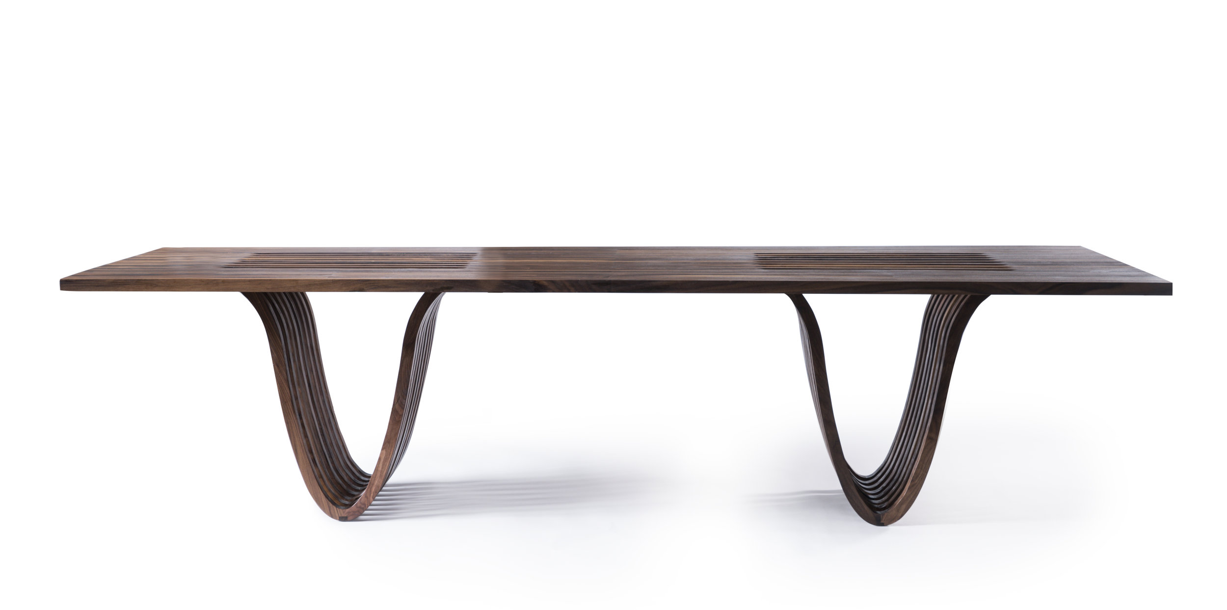
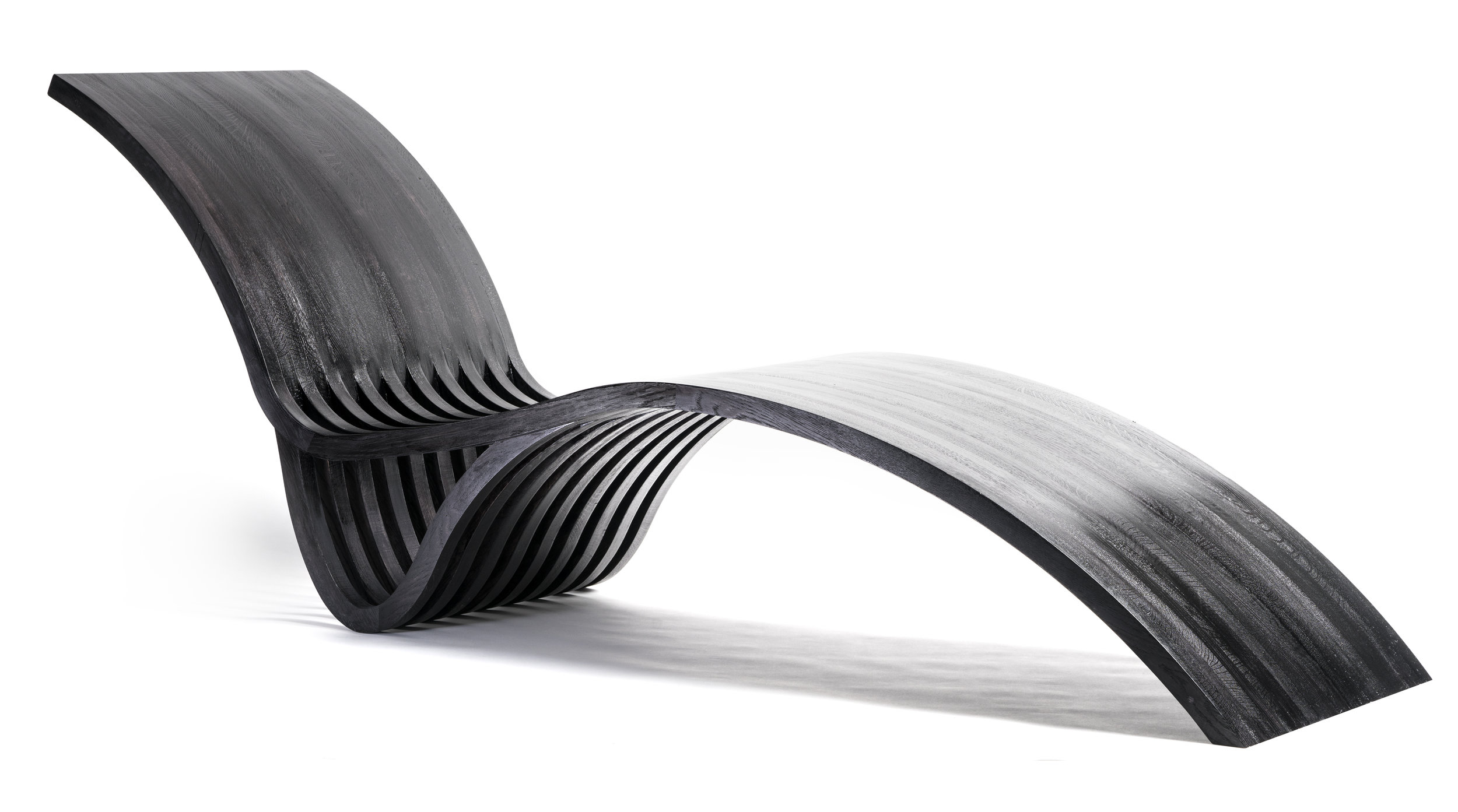
My dear friends and talented architects behind Zimmerman Workshop, Adam and Sofia Zimmerman, recently launched their furniture line; Ot/tra. Simple shapes, modern yet organic lines and precision craftsmanship set Ot/tra apart. I was lucky enough to sit down with them recently to learn a little more about the inspiration, story and challenges of starting their own line.
Bar Stools; Ot/tra, photo by Kronus Studio
Would you please introduce yourself to our readers?
We’re Adam and Sofia Zimmerman. We’ve been working together since 2010 when we started Zimmerman Workshop Architecture + Design—we actually designed Lori’s new studio a few years ago. In March, we launched our furniture company, Ot/tra by Zimmerman Workshop. It’s a collection of furniture we make here in our own shop in Brooklyn. We had been designing various custom pieces for our clients, so creating a collection felt like the right next step for us.
Lori Weitzner Design Studio; Zimmerman Workshop, photo by Garett Rowland
Can you explain where the name Ot/tra comes from?
Sofia: We have a son and daughter, Otto and Petra, and their names seemed to blend nicely. And really, when we think about our ‘why’ for doing this, it’s for them. As parents we strive to show them that beauty is everywhere, in many forms, and that we’re all capable of creating something beautiful. We happen to be doing that through furniture, and we hope they will discover their passions and share their unique talents. On another note, we should mention that we have a third little one—our sweet Westie Dolly June—and even though she’s not part of the official name, she’s here at work with us almost every day gives us reason to take breaks to play!
Adam, Sofia with their children, Otto and Petra, photo by Seagull Photographic Art
What inspired you to start Ot/tra?
Adam: This all started with a kitchen island we designed for a friend’s home in Connecticut. On one end of the island, we had the usual cabinets and appliances at the base. On the other, there was this base of several arches. It was a whimsical sketch inspired by George Nelson’s Platform Bench and Saarinen’s St. Louis Arch but with a more contemporary yet soft feeling. A few years later we adapted that to a conference table for our office, which we had built by a colleague here in Dumbo. That process got us thinking ‘what else can we do’ and one piece led to the next. When we get excited about something, we have a tendency to dive right into the deep end!
Sofia: I remember one of the first conversations I had with you years ago and you talked about designs being timely yet timeless. That’s how I feel about this first collection. Iconic midcentury designs inspired us, but we introduced our own softened contemporary aesthetic to make it relevant for today.
Eliptical Coffee Table; Ot/tra, photo by Kronus Studio
Lounge; Ot/tra, photo by Kronus Studio
What is your favorite part of designing for the line? Drawing? Technical problem solving?
Adam: To me, it’s prototyping in real scale and with real materials. As an architect, there is sometimes a bit of a disconnect sitting in an office all day while someone else builds your work. There’s also a timeline disconnect in that you may design something that does not get built for a year or two. With the furniture, it’s absolutely exciting to draw something one day and then see it the next. It’s fun to play with it and change it. The design experiment works much quicker in that manner.
Ot/tra workshop photo by Michelle Guanca
Can you tell me a little bit more about the materials used in each piece?
Adam: We use solid lumber only. We have bent over backward to only use wood. There are instances in which it would be easier to use metal hardware or other materials to simplify manufacturing, and to be honest there are some concealed metal fasteners in some of the joinery. But those fasteners could be easier to install if exposed or if they were larger. And under no circumstance will we or do we use laminates. Everything is honest, solid, hardwood. We deliberately selected Ash, Oak and Walnut because we love the properties and grains of each. It’s amazing how varied wood gets when you line up several boards directly adjacent to one another. We embrace that as a design element in a curated way. For each piece, we select grains and boards and lay them out in a salt and pepper fashion.
photo by Michelle Guanca
You make each piece in Brooklyn, can you explain how this came about?
Sofia: We hadn’t planned on this part! Our intent was to partner with a manufacturer somewhere within a few hours of New York. But we had a hard time finding someone, even after we expanded our ideal geographic area. Several pieces are really quite complicated, and the response from most that we spoke with was that we would need to simplify the design before they would work with us. That’s something we just weren’t willing to do, so we decided to do it ourselves. We got just enough space and equipment to get us started (with longer term plans to expand to a bigger shop), hired a team, and we’re really glad things worked out the way they did. Not only can we be much more hands-on, but we also have the ability to customize more freely for our clients (which can be complicated when working with an outside vendor) and experiment with new designs.
Ot/tra workshop; photo by Michelle Guanca
What is one lesson you learned starting a business the second time around? What is one thing you would’ve done differently? What is one thing you feel like was a success?
Ha! It definitely does not get easier. I guess that’s relative, it probably has been easier but our scale and aggressive rollout were a little different this time around. Even though we’re technically working within the same industry, Ot/tra presents a whole new set of challenges that we would not have expected. It’s a product rather than a service so you have to fully develop the product in advance of coming to market. As an architect with a license in hand, you can set up shop and get started. The furniture, on the other hand, took a lot of work just getting the doors open!
If I could go back and start over, I’d say I would have bought different equipment and approached production a little differently. Given that making it ourselves was so unexpected, we kind of fumbled through it to be honest. And in doing so we spent time and money on equipment and techniques we later realized are misguided. But I think that’s part of the fun, figuring it out along the way.
The one thing that has been a success is maybe the blissful ignorance of just diving in. Thankfully nobody was around to tell us just how hard it would be!
Adam and Sofia Zimmerman; photo by Michelle Guanca
What do you see as the future for the line?
Sofia: For now we are focused on building our brand and adapting the design from our first collection to a few new pieces based on feedback we’ve had at the show’s we’ve done (ICFF, AD Design Show, BKLYN Designs). For example, we were asked several times if we have a console table, and that’s one piece we just completed and are excited to share. We are also experimenting with other woods and finishes. In the future, we would love to introduce other materials into the mix—especially textiles, because as I’m sure you know, these also balance functionality and artistic expression. And don’t be surprised if you see a line of pet-related furniture in honor of our Dolly…it’s time she get some attention too.
Addendum
A true Thanksgiving; I hope everyone had a wonderful holiday!


